 been.design
A SaaS homepage checklist, with real project examples.
A useful SaaS homepage explains who the product is for, what task it helps with, how it works and what to do next. Review those decisions with real product material and documented evidence before adding more sections.
1. Name the audience and the job.
Write a plain-language answer to three questions: who is this for, what are they trying to do and how does the product help? Read the opening without the product logo. It should still make sense.
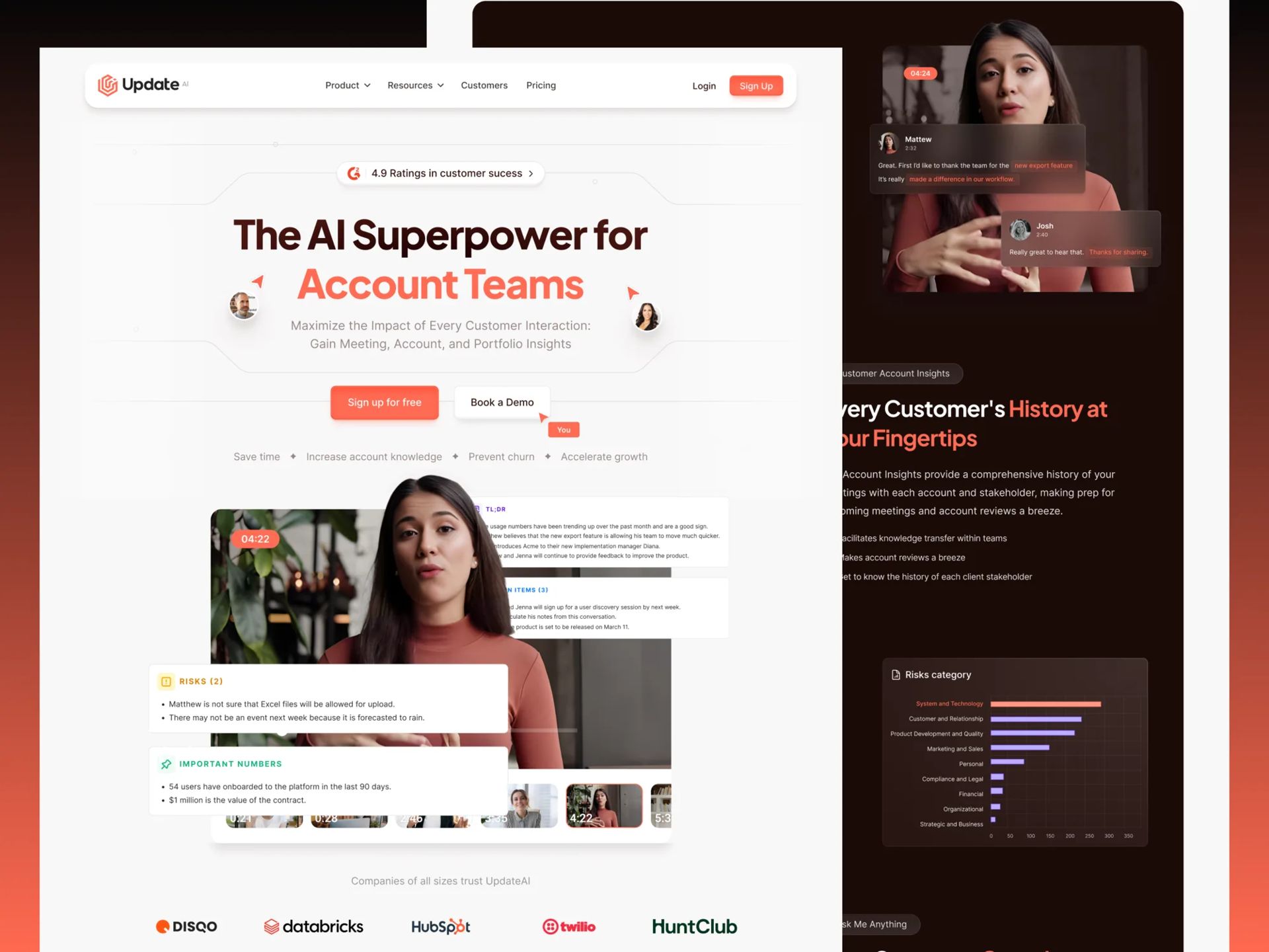
Update.ai's project organised its story around the work of Customer Success and revenue teams. That was a more specific starting point than describing the company only as an AI platform.
- A named audience or recognisable situation.
- A concrete task or workflow.
- A benefit the product team can explain and substantiate.
2. Show the relationship between input and output.
A screenshot becomes more useful when someone can understand why it is there. Use its caption or surrounding copy to explain the workflow, not simply announce another feature.
Minexa's website story moves from a webpage through extraction setup into structured data. That sequence gives the browser extension and API a shared context before introducing deeper detail.
3. Check every piece of proof.
A customer quote, interface example and performance figure support different claims. Keep the original wording of a quote, get permission for the intended use and identify the person or organisation accurately. An illustrative screen should not be presented as a measured customer outcome.
For a metric, record the source, period, sample and definition. If the evidence only documents a deliverable, describe that deliverable. Our case studies keep reported results qualified instead of promoting them to independently verified performance.
4. Match the next step to the offer.
LeanScale's landing page connects its Clay consulting explanation to a free diagnostic. A product trial, a sales demo and a consulting call would need different expectations and follow-up details.
Review the action label, the destination and the information a visitor needs before proceeding. Test the complete path on a phone and with a keyboard, including any external booking or form interface.
5. Give detail a useful destination.
Keep the homepage focused, then link to genuine product, use-case or implementation detail. Do not remove a necessary explanation just to make the page look shorter; place it where a visitor can find it.
On this site, separate services, case studies and guides let each page answer a different question. This is a structure to adapt to a real content inventory, not a requirement to publish the same number of pages.
A simple review sheet.
| Question | Record before launch |
|---|---|
| Can a visitor explain the offer? | The one-sentence answer and the section that supports it. |
| Is the product shown accurately? | Approved screens, captions and availability notes. |
| Can the proof be checked? | Source, permission and limits for each quote or metric. |
| Does the next step work? | Destination, confirmation and agreed measurement event. |
| Can visitors find deeper detail? | Relevant product, case or service links. |
Sources and further reading.
Primary documentation referenced for this guide. Platform features and requirements can change; check the current documentation for your project.